The Challenge
-
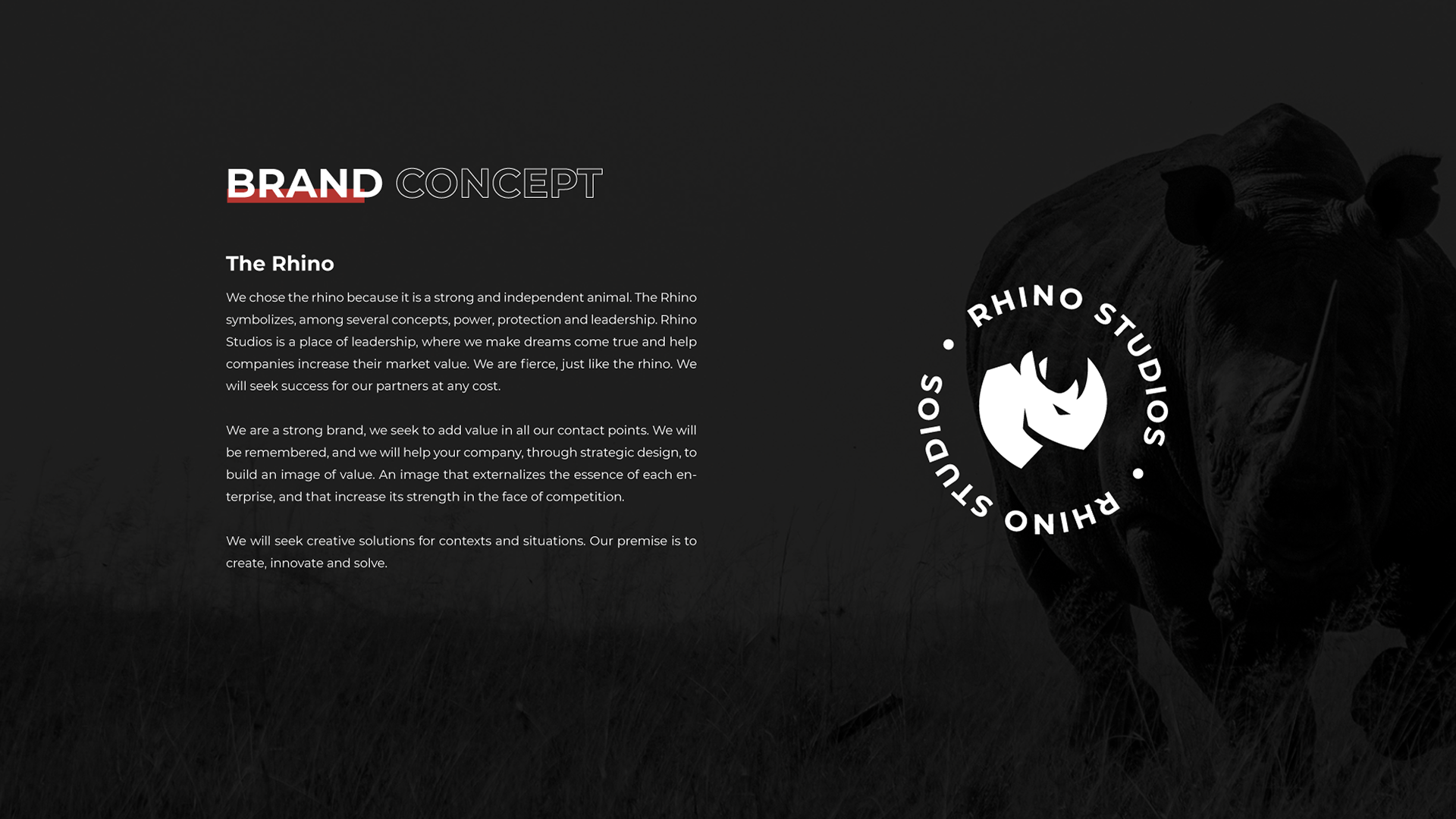
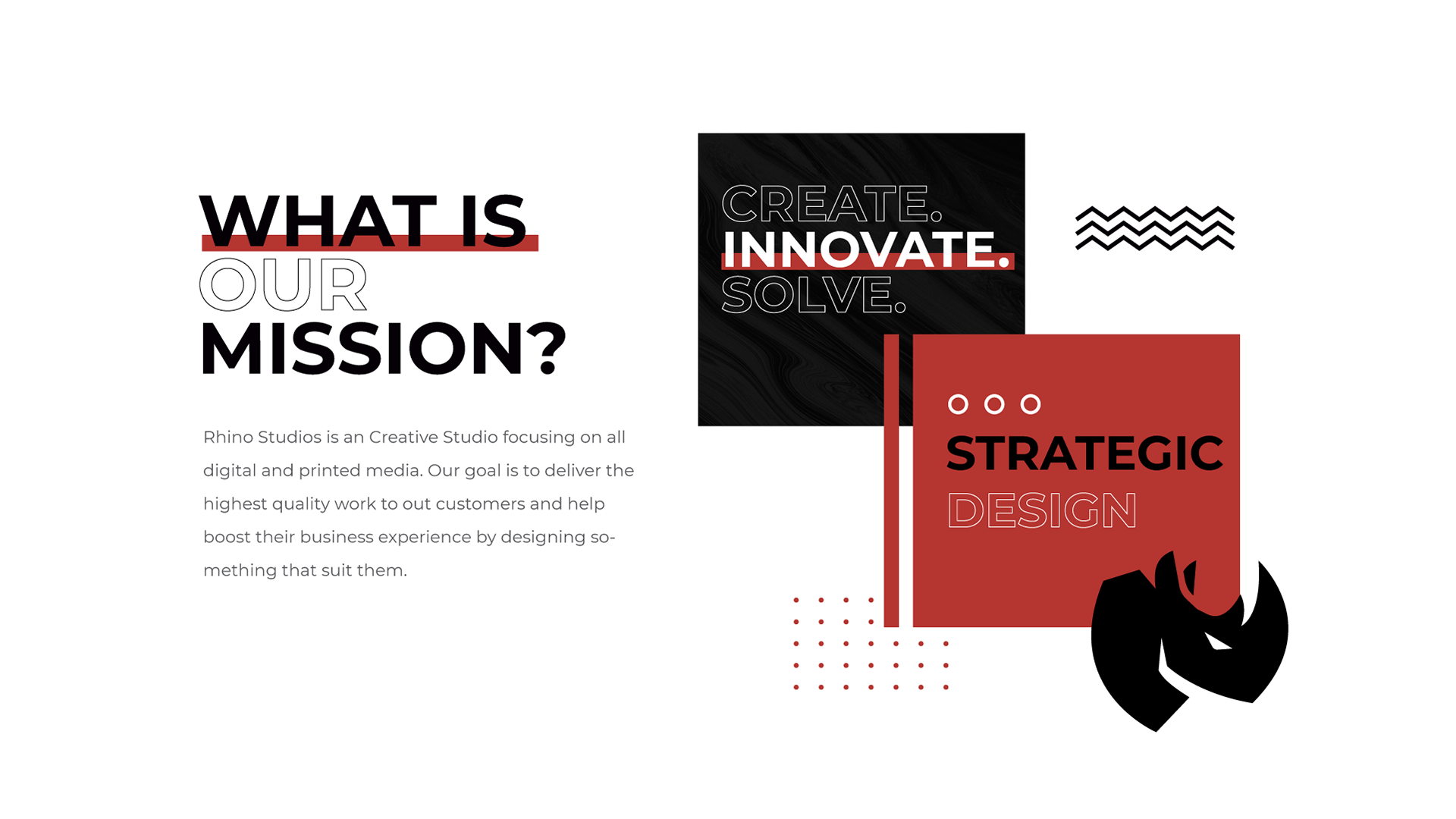
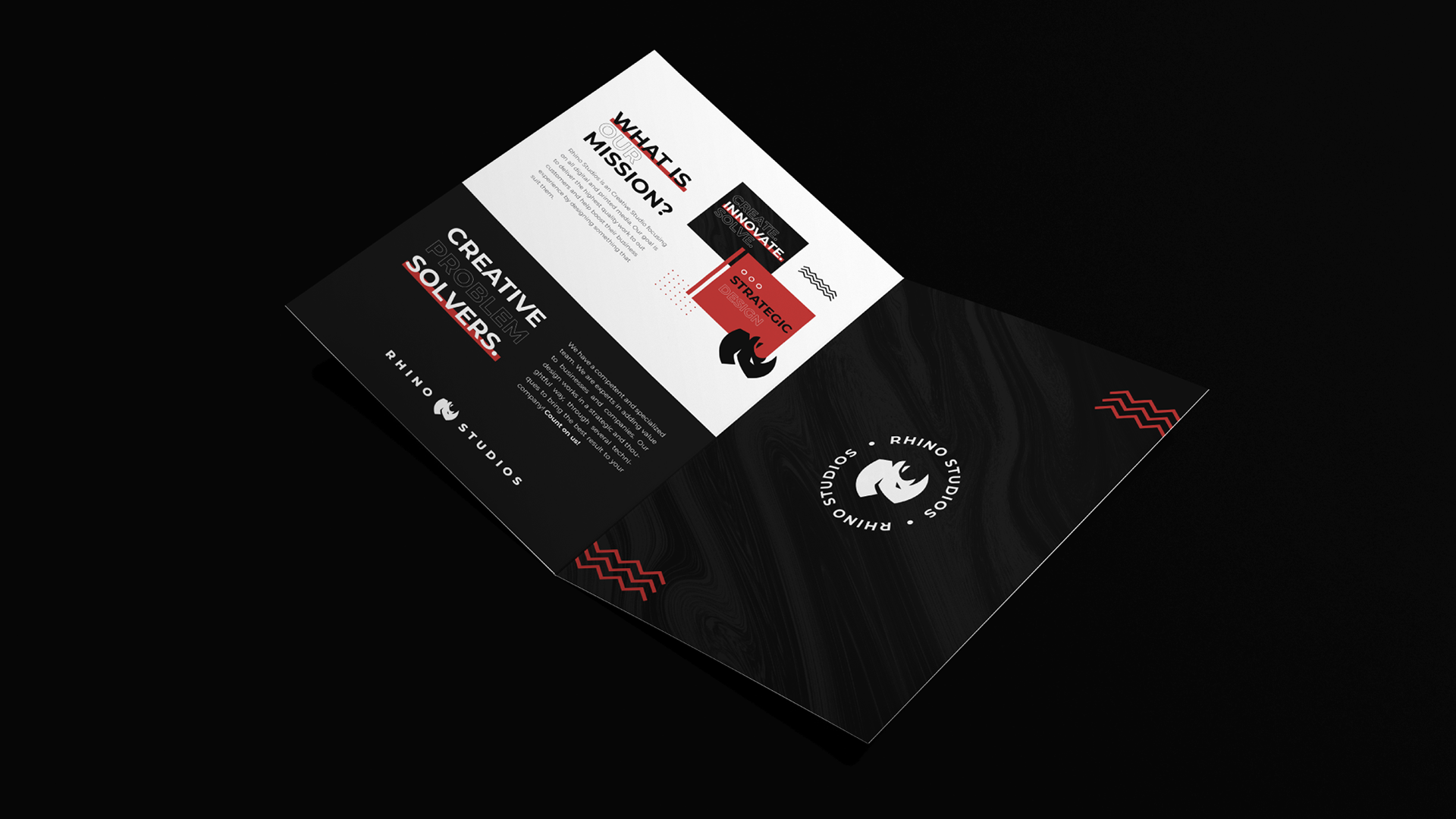
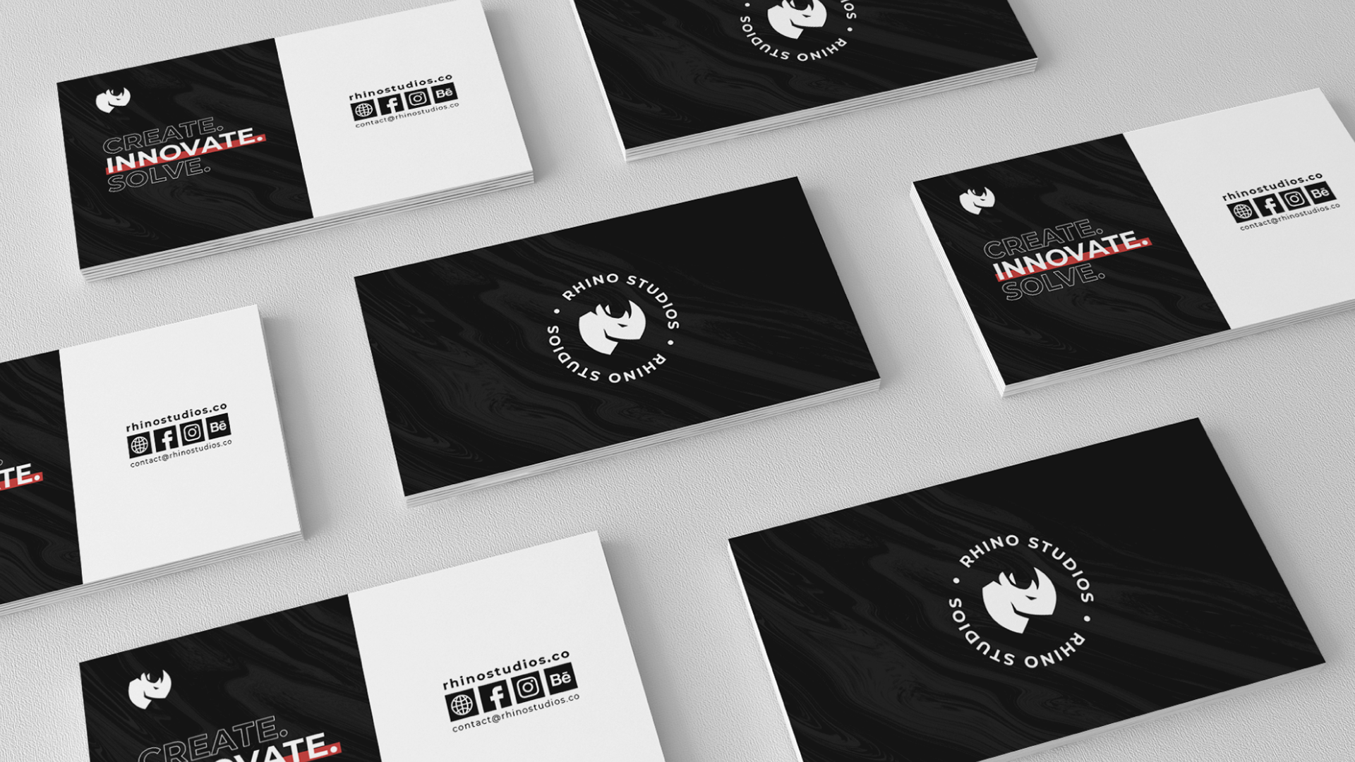
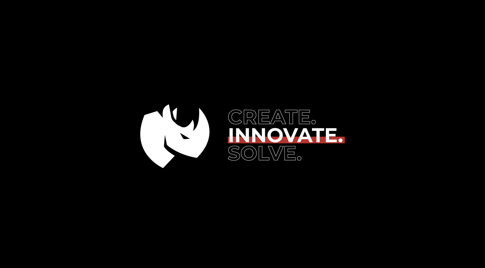
We wanted a strong brand that showed aggressiveness in the market. We wanted a name and symbol that was strong enough to lead teams, companies and add market value.
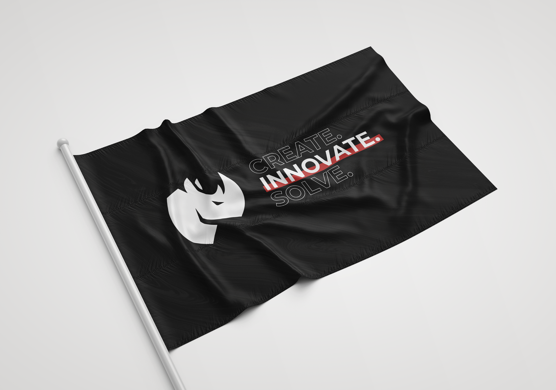
We think of the rhino, a strong animal, with a deep and also heavy concept.
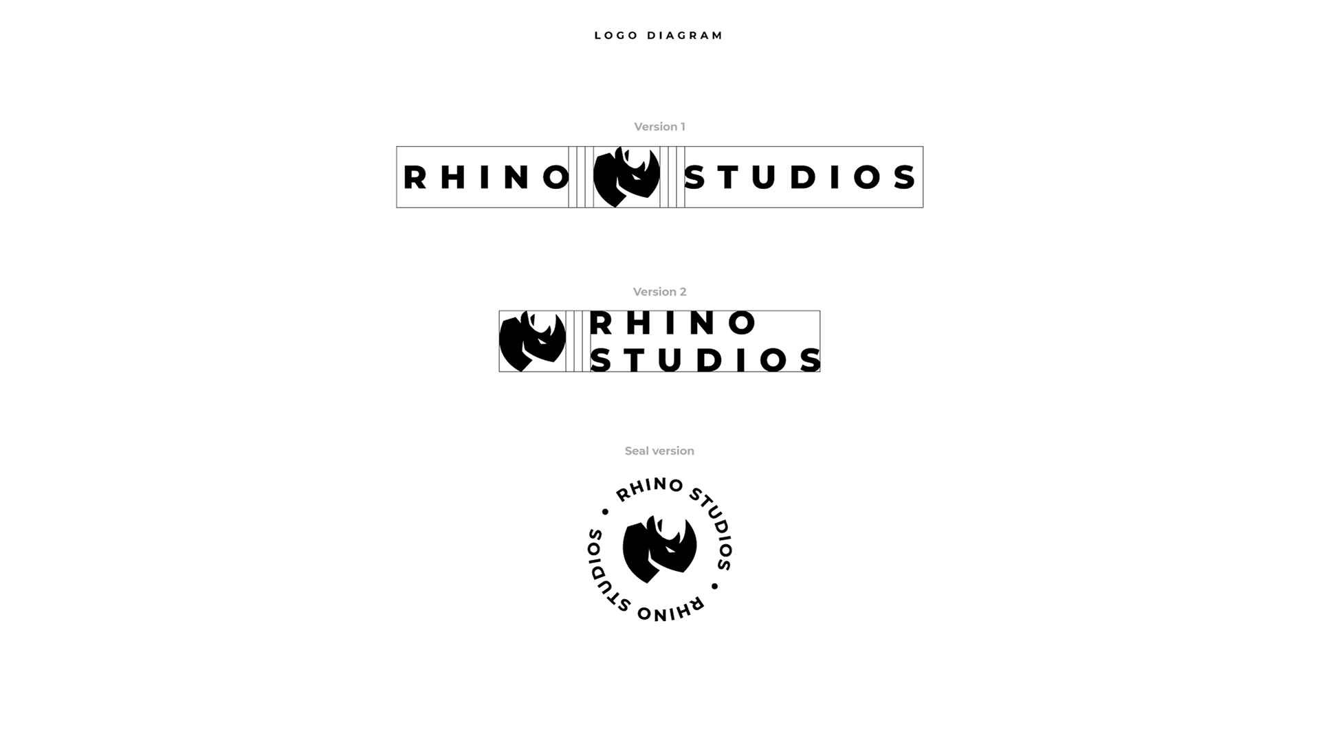
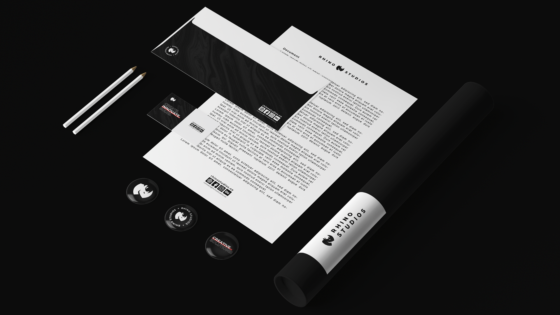
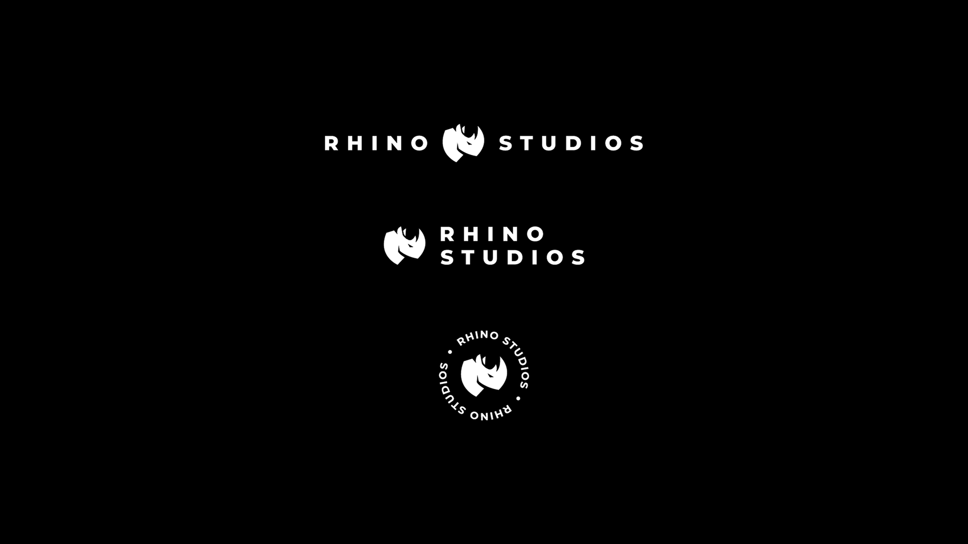
The brand was developed around these concepts. Black and white was chosen to convey seriousness and strength, and above all, sobriety. The layout was also designed so that it would not be so serious, but rather relaxed, breaking the "square" climate of the brand a little.